
This is Cavendish.
Unite a house of brands under one banner - including your own creative agency… no pressure…
Role: Brand positioning | Value Proposition | Messaging | identity | Creative direction across all marketing mediums
Background
In October 2022, BECG Group underwent a management buyout, changing the business's trajectory in multiple ways. But no external entity came along and wiped the slate clean, and there was no mass injection of new blood at our senior levels. Instead, this transformation was driven from within. By six passionate individuals already firmly part of the existing organisation.
Knowing such change can be unsettling, our CEO and newly formed executive leadership team made three promises to the organisation and its people:
Unite the teams
Take us to the next level: from market-leading to truly world-class
To re-energise the culture -and have some fun!
Those three promises were no small gesture, and our ELT knew the organisation's structure at this time hindered the ability to deliver against them.
So, we worked on a new proposition and brand strategy that accurately reflected who we are and positioned us as the forward-thinking, progressive and growth-focused communications consultancy we believe ourselves to be. It has involved a comprehensive work programme, including surveys and interviews with clients and staff, industry research and competitor analysis.
Objectives
Cavendish is a UK-wide communications consultancy that works on large-scale transformational projects for clients who are shaping the world we live in. Founded in 2017 it spent x years developing various niche sector specialisms offered via five different brand names. With an impressive client list of 8 offices across the UK and a 150-strong team of skilled people across its five disciplines, it was looking for the next growth stage.
For Cavendish, the opportunity was to be known as a full-service leader in the field, to work as a strategic advisory partner, and to break into new sectors. However, its challenge was that brand awareness was variable across the five identities, and audiences needed clarification on the multiple names. Plus, the internal team lacked a cohesive identity, holding back the collective effort to deliver on the vision. A new brand strategy and identity were needed to drive it forward.
Business objectives:
To win more significant contracts covering multiple services
To develop current clients by cross-selling more services
To enter new sectors
The goal of the rebrand was:
To build awareness
To strengthen the internal culture and cohesion
To reposition the business as a forward-thinking advisory partner
“Our CLIENTS think we are better, than WE think we are...”
Insights
In our internal assessments, staff consistently rated most business units as "about the same" as competitors. Yet, the external perspective from clients paints a different picture – they consistently rate us higher. Notably, clients appraise our creativity more highly than our internal evaluations suggest. The disparity extends to Net Promoter Scores (NPS), where clients express significantly higher satisfaction than our staff. Interestingly, clients and staff share common aspirations: clients seek increased integration of services.
In contrast, staff desired closer relationships between business units, aiming to foster the exchange of valuable information and experiences. This convergence of perspectives presents an opportune moment to capitalise on, as clients and staff express a shared ambition to 'go beyond the brief.' This scenario sets the stage for a proactive positioning grounded in insight, strategy, and vision—akin to looking around corners for innovative solutions. Importantly, clients' high level of confidence in our abilities allows us to be bolder in our endeavours, aligning our actions with the trust and expectations vested in our capabilities.
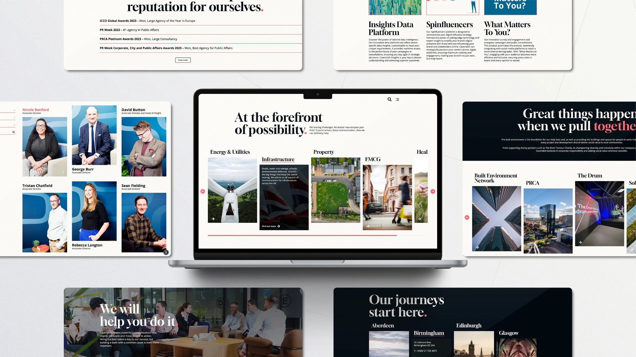
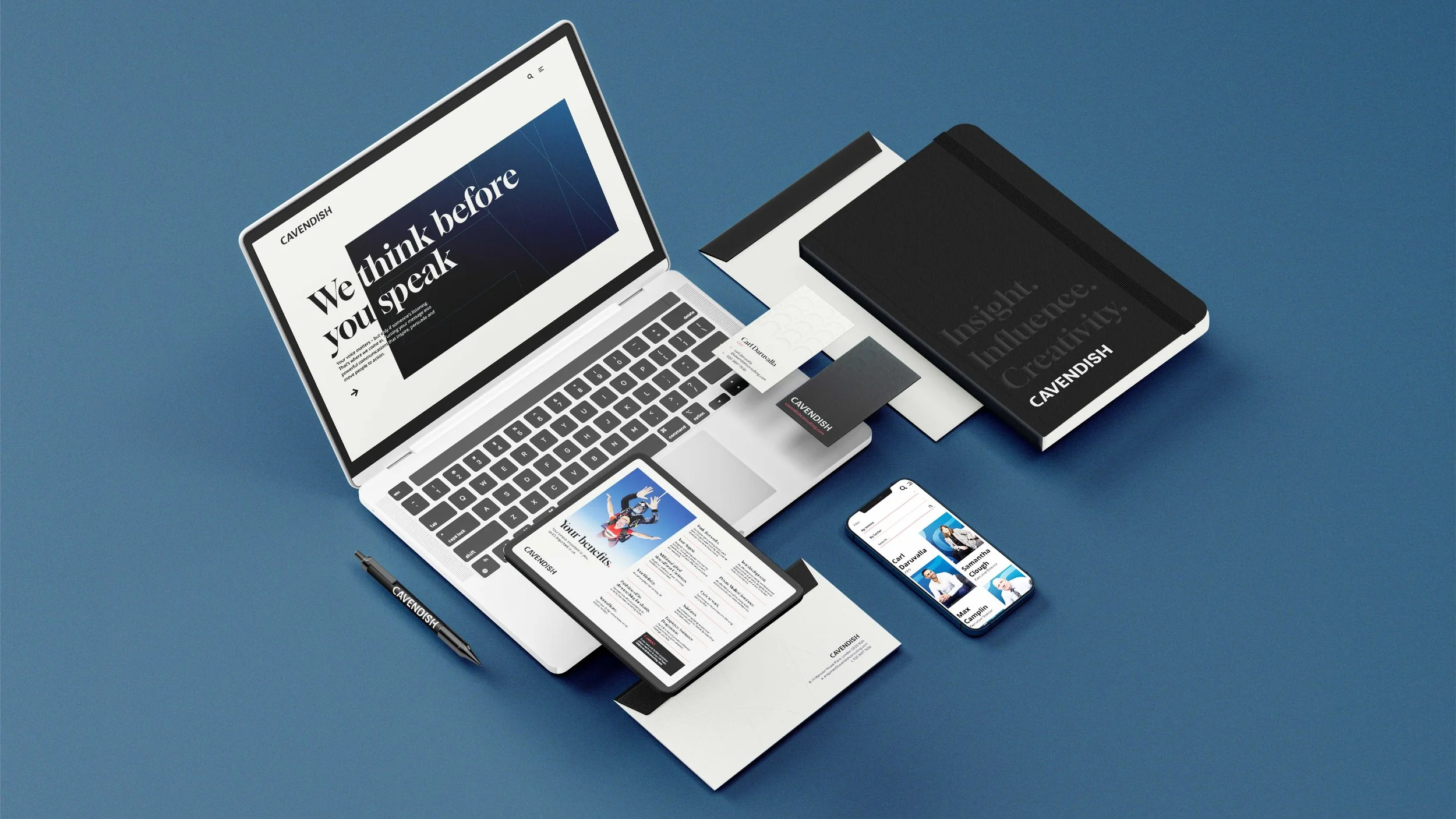
The new brand identity saw a new logo, colour palette, and typography developed along with graphical elements for use across all touchpoints. The identity was crafted to exude confidence and creativity while harnessing an energised, contemporary feel. A type-led solution with oversized headings enabled thoughtful and intelligent content to be the hero.
Colour is used sparingly, with high colour accents bringing sparks of interest. Additionally, oversized punctuation is embraced as a distinctive visual asset, with brackets and quotation marks becoming recognisable brand icons. A bracket shape derived from the ‘C’ of Cavendish serves as a flexible viewfinder device to frame content.
A library of photography and illustration supports these graphical elements. Photography centres on people, bringing the human and societal aspects of the work to the fore, while illustrations have a sophisticated editorial style, supporting thought leadership content. The identity was applied to the website, social media pages and content, decks, and internal materials.
Strategy
The brand strategy covered both brand architecture and brand positioning. A significant decision was made to replace the group structure with one brand across all services. This would enable the business to translate its scale into awareness better; it would be seen as a significant player in the market.
The new consolidated brand would be positioned as more strategic and insight-driven, reflecting a genuine strength that should be amplified. Another unsung strength would be addressed, too, namely its expertise in community engagement. Cavendish excels in helping clients navigate complex and sensitive situations—lastly, the societal impact of its work on large-scale projects needs to be more explicit.
The strategy focused on creating a brand that would be seen as a reassuring leader; it needed to convey gravitas and dramatise its skills in data and insight. And there was a missed opportunity that required to be rectified: celebrating the calibre of its people and their crucial role in relationship-building with clients and third-party stakeholders.
‘Thinking Around Corners’ was the core brand idea: Cavendish’s knowledge and experience enable it to think ahead for clients, providing a clear vision of the path in front of them. This promise that all departments could stand for would elevate the agency's role into a more advisory territory. Five values stood at the heart of the strategy: Bold. Curious. Impactful. Aspirational. Authoritative.
This brand strategy was translated into external and internal value propositions and was used to inspire the narrative, visual identity, communications, voice, and behaviour.
One voice, with range.
Communications from all teams across the business needed to be aligned and consistent to act as one. One of the existing brand names – Cavendish – was chosen as the new name. It was selected to retain continuity with the past, bringing an authoritative tone.
The descriptive tagline line ‘Insight. Influence. Creativity.’ – was developed as a unifier with relevance for all parts of the business. A new verbal identity defined clear core messaging, including a tagline, message platform and brand voice guidelines. The brand voice should always feel ambitious, insightful, and accessible.
See for yourself.
“The rebrand has energised the business. It feels like we know why we’re here and pulling in the same direction. I’m excited for the next phase of Cavendish”
— Samantha Clough, Executive Director